Layers of Details

Dear Liza,

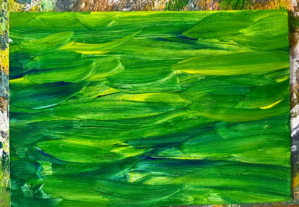
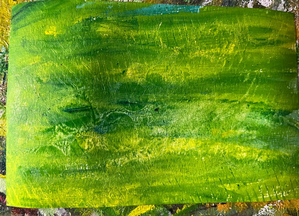
I showed you some of the acrylic cards I made with Ruthie Inman last week. After an hour and a half of gleefully painting, I had seven different card fronts in blues and greens, and no idea what to do with them.

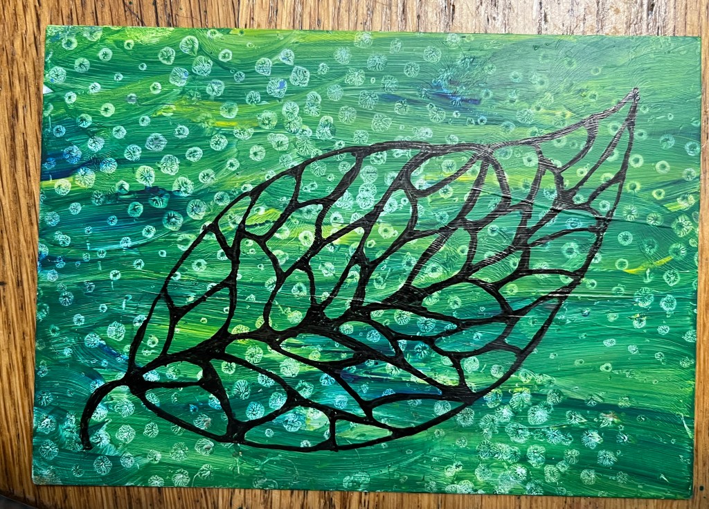
I wanted to do something, though, and I decided to start with this one.

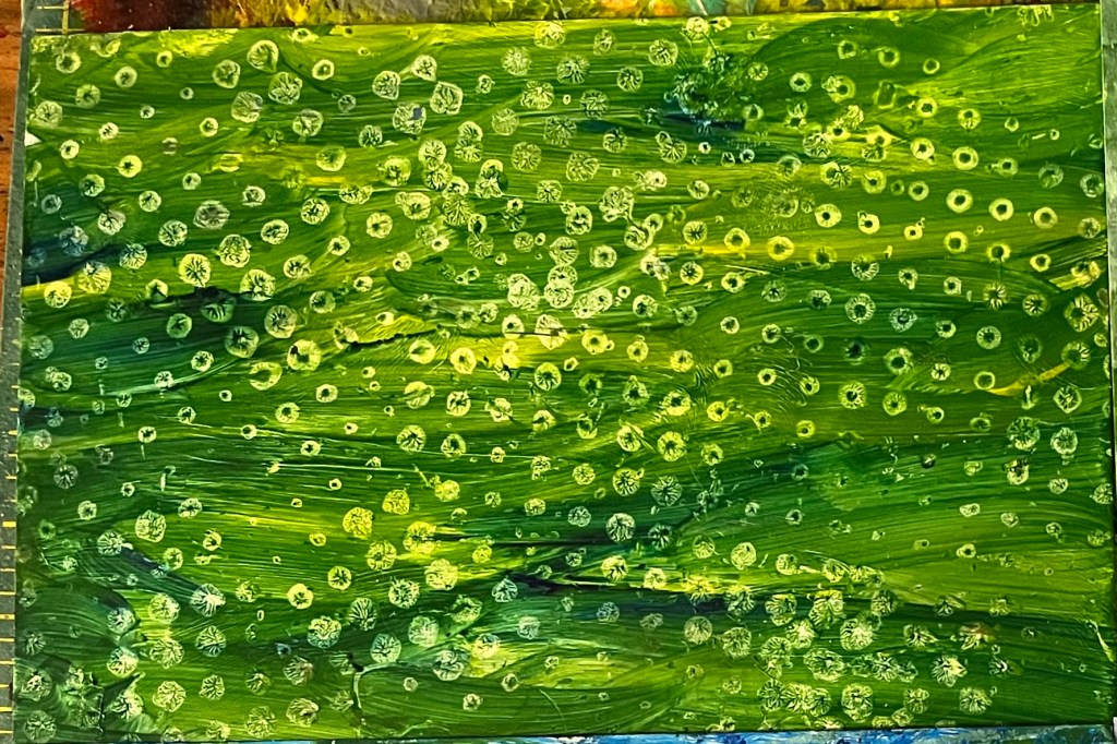
Looking for ideas, I hunted through my box of old projects, and found a leaf we did several autumns ago.

So I drew the leaf and put in the divisions. and then thickened the lines and rounded the corners with a micron 08 pen. I liked it, but I could tell it wasn’t done yet.

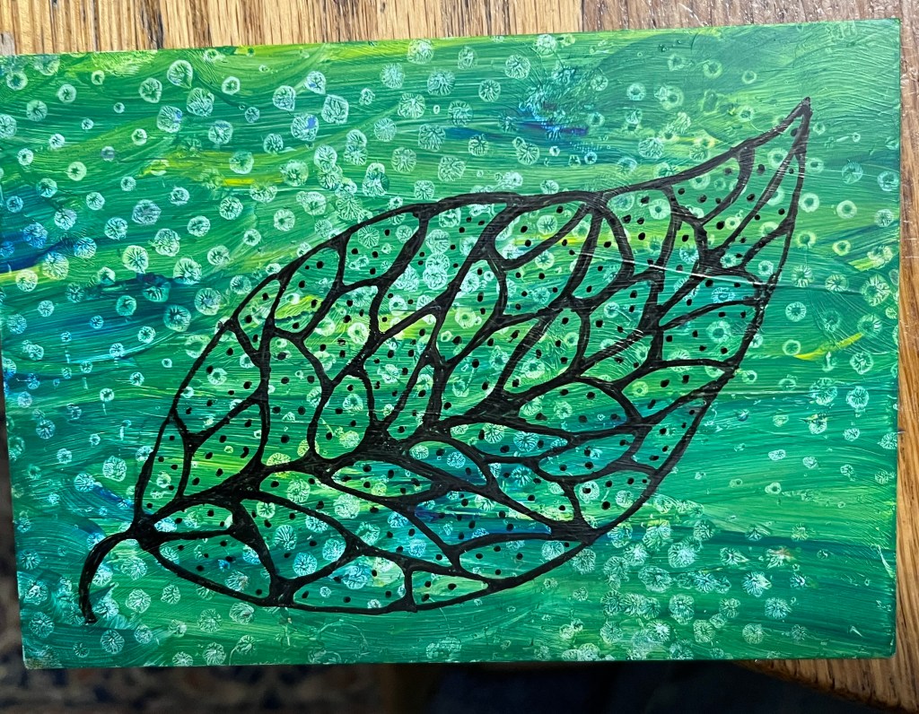
With the dark background, it needed something more in the leaf to make it stand out. I added a few dots, liked the look, and just kept adding. It was better. But not done yet.

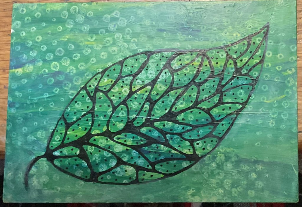
Auntie Bridgett suggested that I make the outside a bit lighter. I used yellow and white acrylics, thinned with some medium, to lay down a few thin layers.

It still wasn’t right, but I was afraid to do anything to it for fear of making it WORSE. Bridgett to the rescue! “We can take a picture of it, put it in my computer with Procreate, and see which looks best.” This was a new idea for me, but I’m always willing to learn.

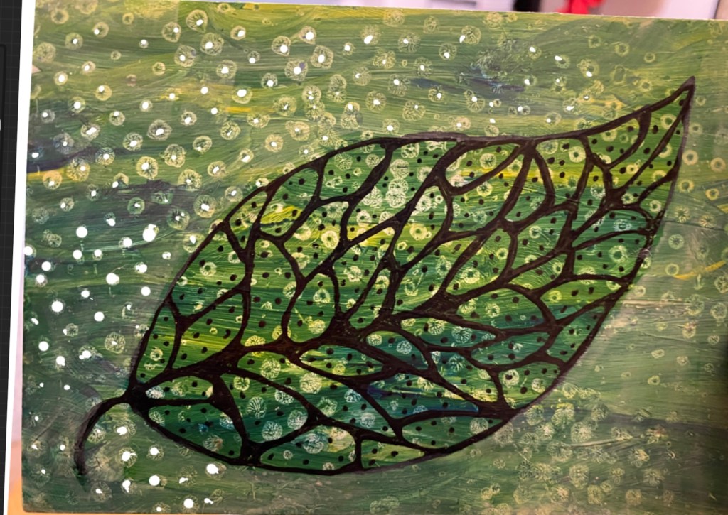
How about these dots on the outside? Nope.

Maybe outline the sections? Yellow? Or white?

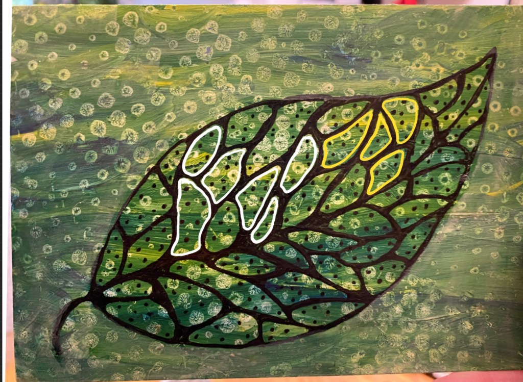
That was it! Yellow, please. So I picked up a yellow Posca marker and made it right.

And boom, done, it’s on its way to you!

Love,

Grandma Judy

Fun with Acrylics

Dear Liza,

Ruthie Inman has done it again. On a chilly day after two very busy days, I was feeling tired and not terribly artistic. Not awful, but … blah. And sure enough, within ten minutes of our art group’s beginning, I was slapping paint down like an inspired ten year old.

Before we got together, I had started an alternate project, coating the photo side of old postcards with gesso so they would take paint better. My plan was to use the same paints from Ruthie’s project on my alternate postcard project. I pulled out a dark blue, lemon yellow, and white as my color scheme.

I started with my project, laying down colors in a pleasingly haphazard way. Wet but not runny, brushing to blend until I liked it.

Then, at an inspiration from Ruthie, I pulled out my impressions makers (an odd collection of Starbucks coffee cup holders, fruit packing sleeves, crumpled tissue and bubble wrap) to change the textures of my colors.

I made about eight postcards in all, and one even looked something like Ruthie’s idea, this lovely, opalescent landscape. Of course, following directions is always optional, but it’s good to try new things.

Anyway, with this pile of colorful backgrounds, I can think about what can go on for the next layer. Some more textures? Collage pictures or words? Maybe some handwritten sentiments or just pretty squiggles?

Who knows?

Love,

Grandma Judy