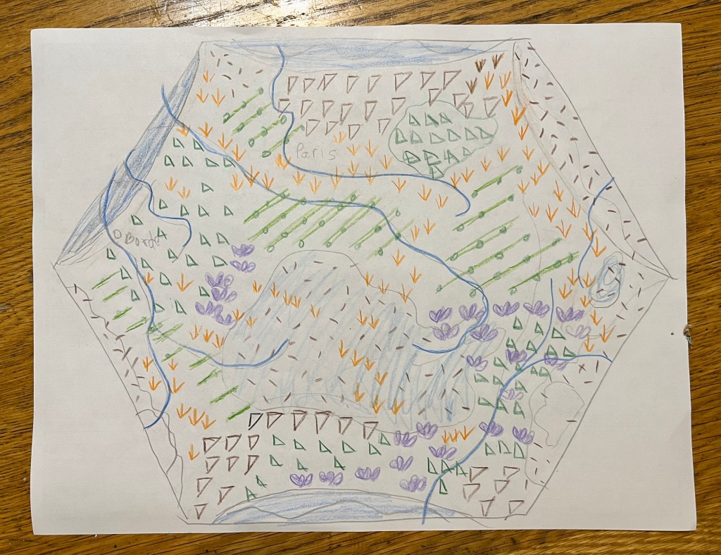
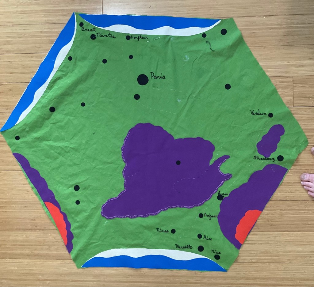
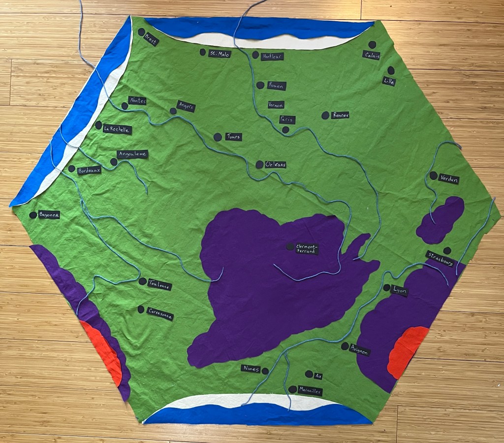
I’ve been working on the French Map Quilt for a couple of months now, and I think I’m almost done with the top.
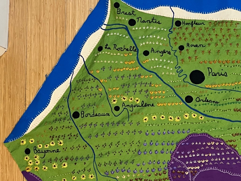
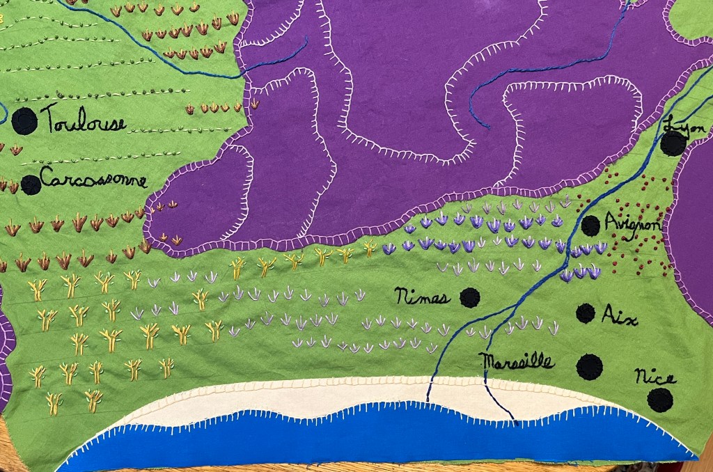
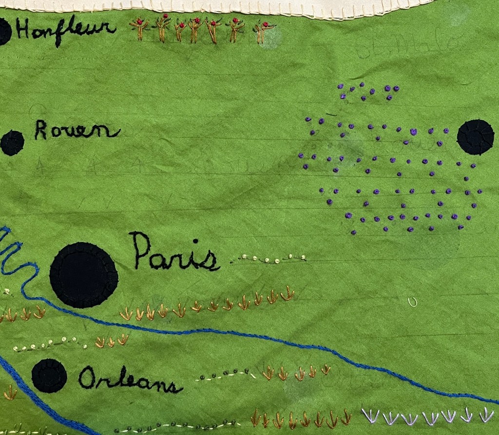
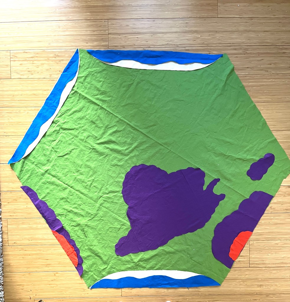
My problem is, I can’t look at the WHOLE thing at once, except when I take a picture of it. At about a meter across, it’s a lot to focus on. Below, I have broken it up into four photos.
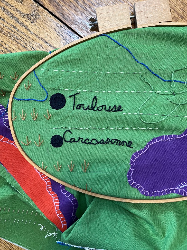
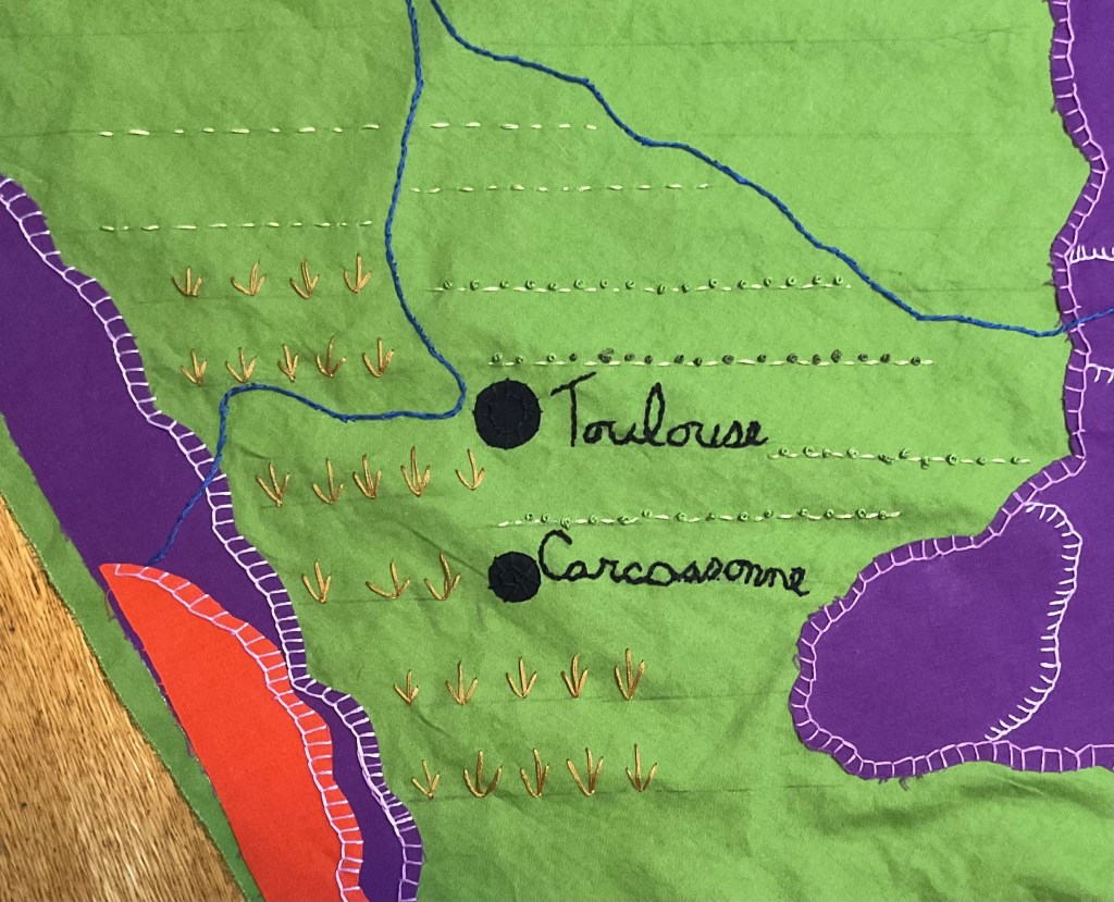
Looking here, I can see that I need more ‘grazing’ icons on the Massif Central and heading up into the Alps.
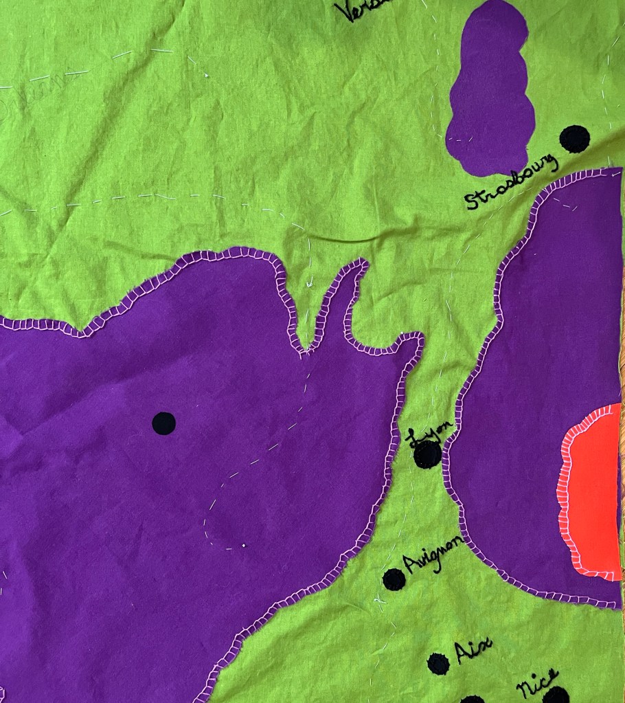
Here, the Pyrenees Mountains look a bit bare. And should there be something at the shore? Wavy lines to show the foam and dunes, maybe?
It’s hard for me to be objective… what do you think?
For now, I’m going to fold it up and let it sit. I’ll get back to it when I can see it fresh.
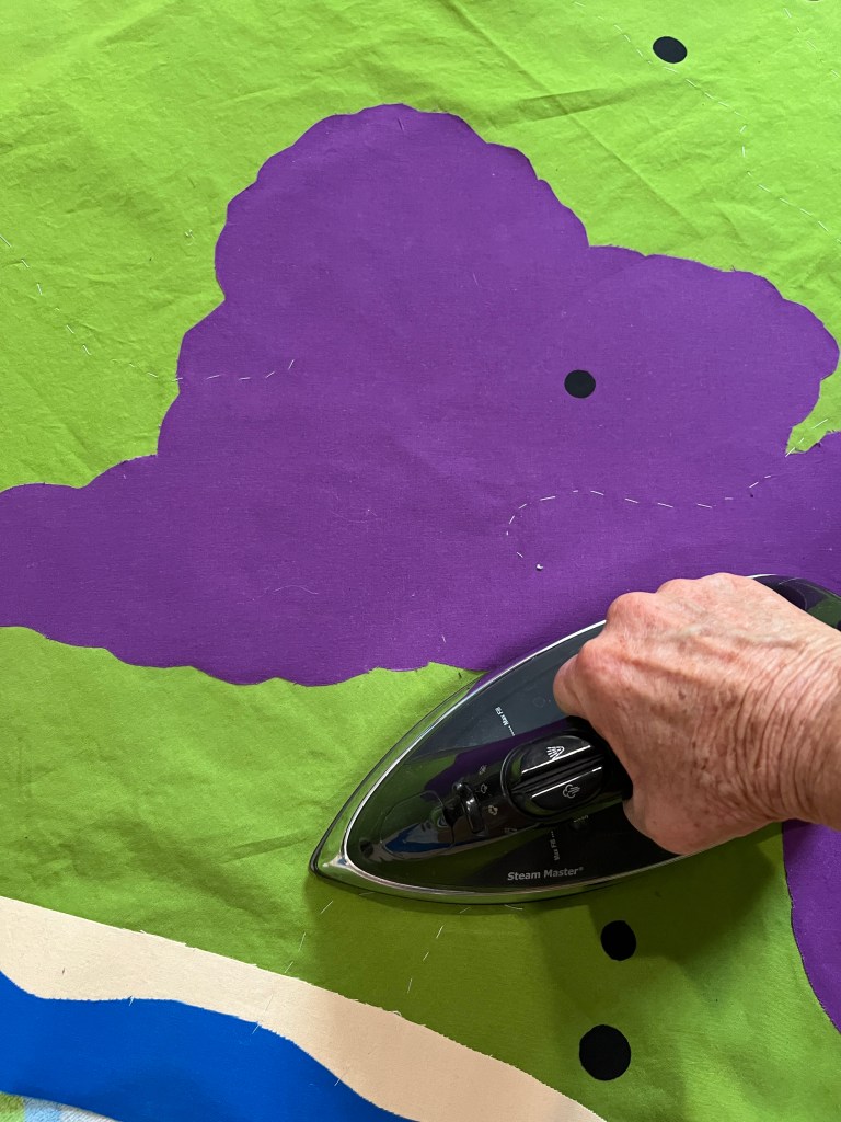
Once I realized what was wrong with my French map quilt, I got busy putting it right. Every inch on the embroidery is getting re-worked with more color, contrast, and texture.
For example, here is a section of Provence, in what I am now calling the Rough Draft stage. At the time, I thought it was done. But the olive trees are flat, and the lavender is almost invisible.
A few days later, I had added enough contrast that the area was what I wanted it to be… bright, vibrant, and inviting.
Looking further north, I realized that the glorious Loire Valley, the “Garden of France”, was looking very sparse. Too much flat fabric, not enough cultivation going on.
So I drew more lines of crops, and then more between those. Straight rows became waving hills and I got braver with colors. NOW the Loire seems like it’s living up to its potential!
I guess I’ll just keep adding stitches until it seems like I should stop!
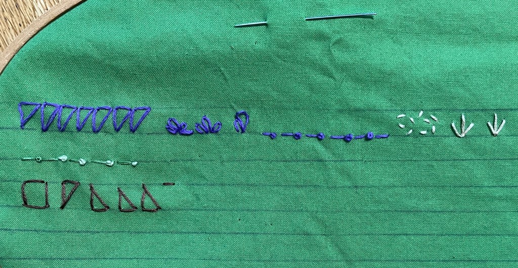
Now that I am ready to put the land-use icons on my map of France, I am getting a little worried. There are going to be hundreds of these little rascals!
I want each icon to be easy to sew, of equal size, and to look vaguely like what it represents… a row of crops, a tree, or a vineyard.
Watching videos of embroidery, I noticed the importance of straight lines, so I practiced on some.
I am happy with some of these, but the squares and triangles were not right. I did more experimenting.
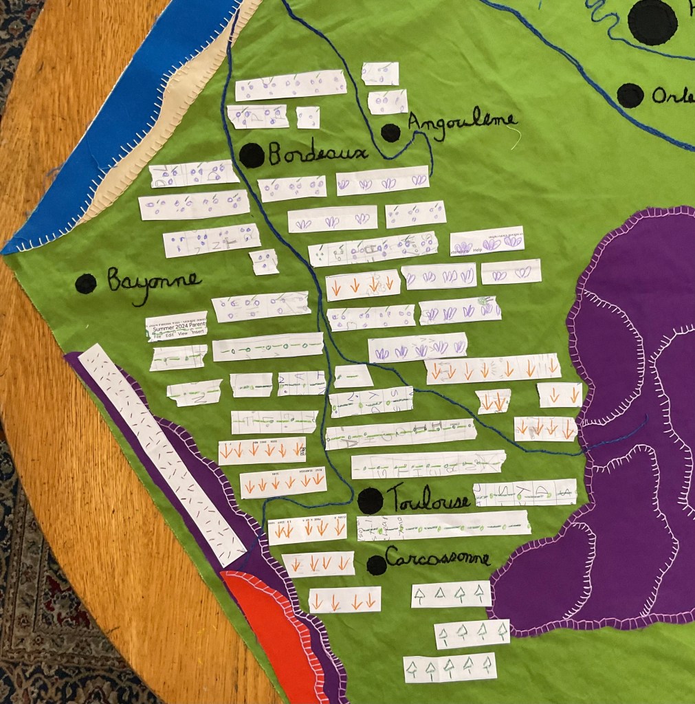
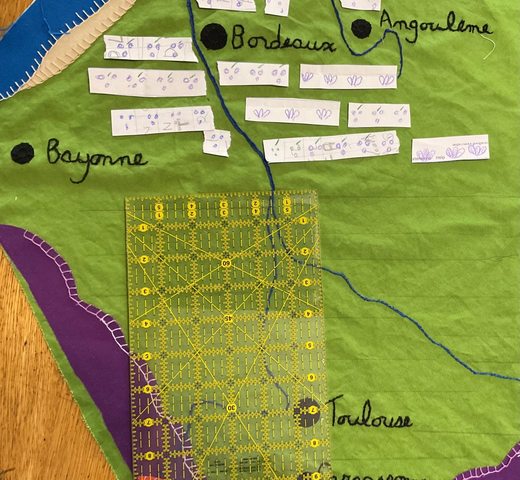
I also had to work out the right scale for the icons. Those first ones were 1 centimeter high, which I realized, since the whole map is about a meter wide, is TINY. So I tried some at 2 centimeters, which made more sense. I drew the 2 cm. icons on wider strips and laid them down according to the land-use maps I’ve been studying. I started with the south western part of the country
I took this picture to remind me what went where, then used my clear ruler to get the guide lines all straight.
And now, I have started sewing the icons! These are for wheat fields and row crops.There are still a couple hundred yet to go, so it will be a good long time.
It was my intention to be very methodical about this quilt. First the land forms, then the cities, then the rivers, and so on. But that wasn’t working for me.
Embroidering the names of the cities is extremely fiddley, and hard to do for very long without getting a little crazy. There was lots of squinting and mumbling.
So I started alternating. A few cities, then some easy, sweeping lines on the mountains, then a few more cities. Then start on the Loire!
Then a walk in the park to stay balanced and happy.
I love doing embroidery. It can be restful and contemplative, just making stitch after stitch and feeling a picture grow under my fingers. But sometimes I wonder if I have bitten off more than I can chew.
My French map quilt needs the city names, and these pieces of paper aren’t going to do the trick. The names need to be stitched. All 27 of them!
So I practiced a bit, and then wrote, in pencil, each name on the map. You need to squint a bit to see them, I’m afraid.
Then came the stitching.
I used the embroidery hoop because the fabric felt floppy and it gave me more control, and it worked pretty well.
Once the name was embroidered, I used a small blanket stitch to make sure the city “dots” stayed in place.
I’m still working on this, but making progress. Moving Paris and some other cities slowed me down a bit.
I ask your patience, and my own, as well. Breathe and stitch, Judy. Breathe and stitch.
To put the cities in my French map quilt, I used the same Heat N’Bond fusible interface that I had used to attach the Massif Central and the shorelines.
I traced three different sized circles to show different sized cities. The cap of a vitamin bottle made Paris, a wine cork made the medium sized cities like Nantes, and the cap of a chapstick tube made smaller towns, like Angouleme.
I cut all the circles out during the Olympic beach volleyball matches, which made it much less monotonous. Each one was peeled, then placed and pressed into place.
I realized, once they were all down, that Paris was a bit too far east and north. For a few days, I tried to convince myself that it was fine, and I was going to leave it where it was.
But every time I looked at it, the error bugged me. So I decided to move Paris… which meant I had to move the Seine, the Loire, and all the cities along both rivers.
There were bad words. I’m still in the process of removing and replacing the dots, and you can see where some of the adhesive is still there.
I managed to get “Paris”properly named, so at least I have a point of reference going forward.
I am embroidering each name in a cursive script, much like my own handwriting.
That’s going to take some time, too, but I am happy I corrected the error while it was still possible.
I was feeling pretty good about the shape of my highlands, mountains and shorelines on my French map quilt. Auntie Bridgett admired the lay out, then asked, “Are you going to put anything else on it? Like cities?”
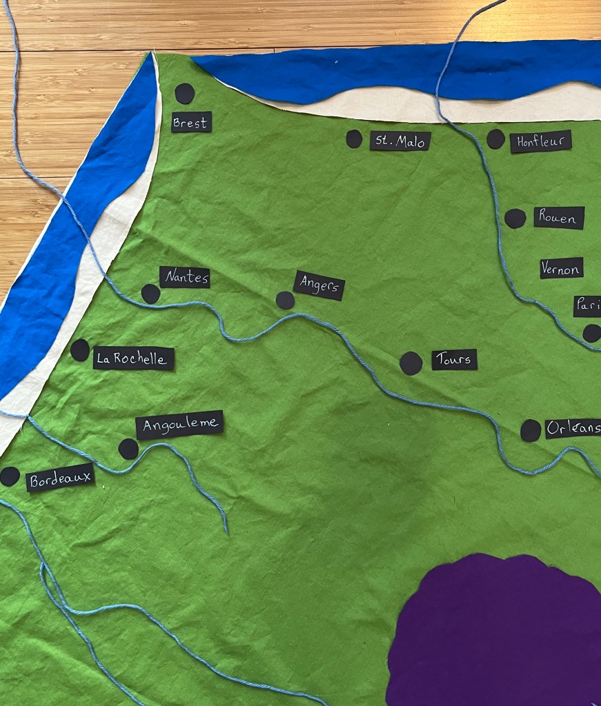
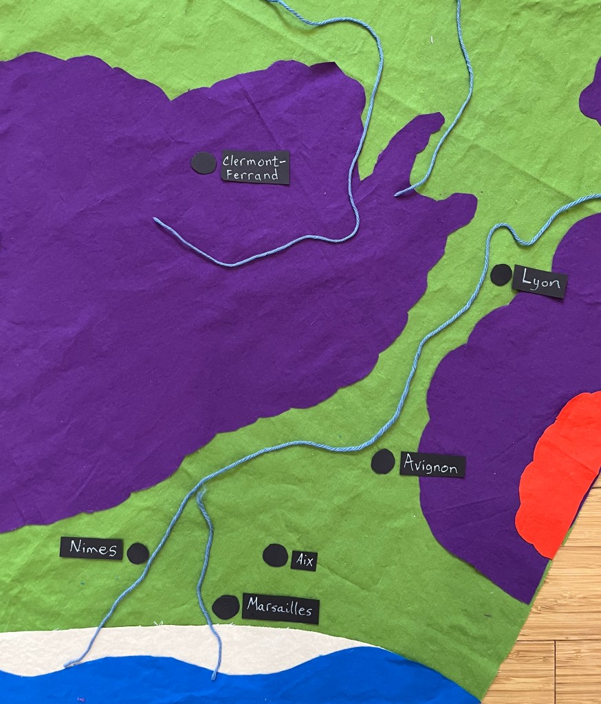
Oh. Yeah. Knowing that most cities in Europe are on rivers, I decided to put in the rivers first.
So, using Googlemaps and blue yarn, I began to lay out my rivers. I’m only putting in the main rivers for now, so you can see (from upper right, going clockwise) the Meuse, the Rhine, the Rhône, the Garonne, the Dordogne, the Charante, the Loire, and the Seine.
Once the rivers were laid down, I felt more confident about the placement of the cities. Paris, Vernon, Rouen and Honfleur along the Seine,
Orléans, Tours, Angers and Nantes along the Loire,
and Lyon, Avignon, Aix and Marseilles along the Rhône.
So now, everything is laid down. But NOTHING is attached yet. If I lift the green hexagon, it all falls off. That’s the next step, and it may take a few days. Be patient with me.
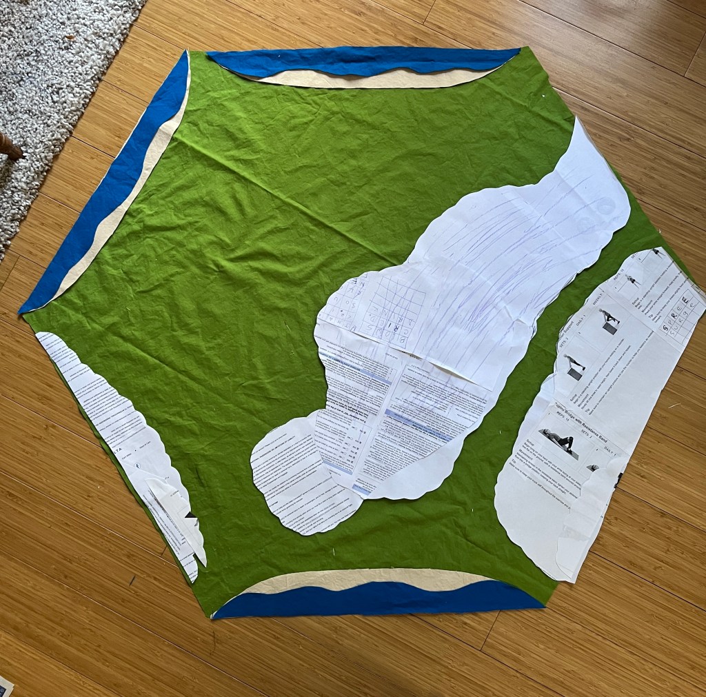
Yes, I have made progress! Once I got the shorelines figured out, everything starting making sense.
I kept looking at my patterns for the Grand Massif, the Alps, and the Pyrenees, and they were just …. Clunky. They made the whole eastern side of the country look like a mountain range, which just isn’t the case.
As you can see….
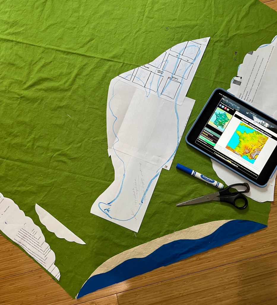
So I pulled up different topographical maps of France to see how I might make them better. Certainly more accurate, and maybe just a little prettier.
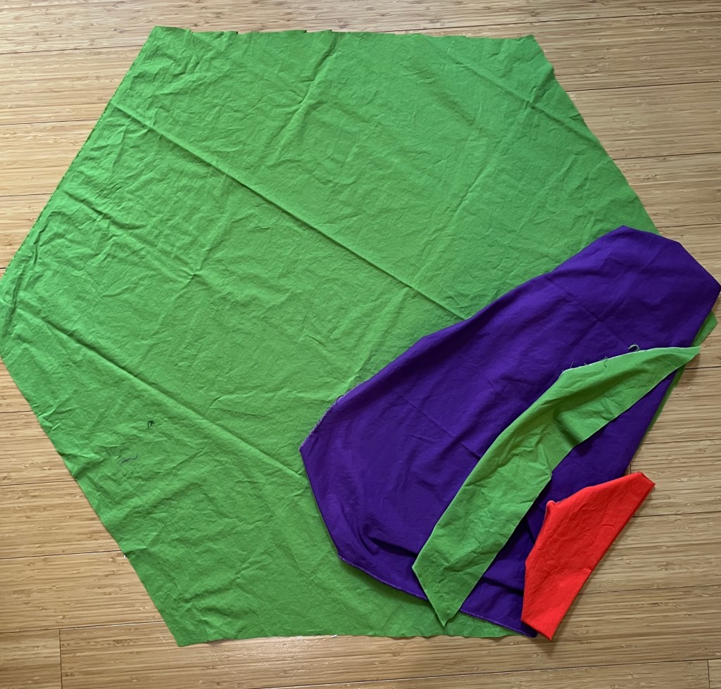
My process isn’t artistic, or even scientific. I glue sheets of scrap paper together and start cutting, staring and trimming until I get a shape I like.
This took a good part of the morning, because there is a lot of cutting, placing, staring, and walking away for a while. During the walking away parts I vacuumed, went shopping, and watched the Olympic Triathlon on YouTube.
And when I got a pattern that was closer to the shape of the Massif, I laughed out loud. Un Escargot!!! That is, a snail.
I like that a lot. Escargot are one of the classic French dishes. Snails are also raised all over France for it, and it is one of Auntie Bridgett’s indulgences when we visit there.
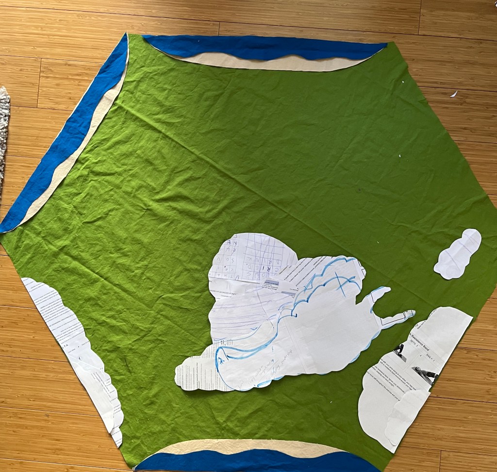
So I chuckled and pinned the patterns down, carefully trimming the lumpy shapes out of the purple fabric. The highest peaks of the Pyrenees and the Alps will be shown in red.
Et voilà! The big shapes are taken care of.
But there is one more detail hanging over my head.
I have this half yard of black fabric that I haven’t used yet. It is part of the color palette, and I think it will give the map some depth and drama. I intended it to be mountains, but it looked like a big black hole. I think it would be better as a detail, a curve or a line rather than a blob.
So now I get to stare at this for a while, and figure out what comes next.
In search of fabric for my France map quilt, I took the # 75 bus to the #72 to Bolt Fabric the other day. It’s a quick trip, and nice to see new neighborhoods.
Bolt didn’t disappoint! I found the palette I had chosen in solid cottons, which will be good for appliqué-ing and embroidering as the project moves along. I got the fabric home and washed it.
And now I need to decide on the style of the map. The main body will be green, the lower mountains purple, and the peaks of the Alps and Pyrenees will be red. Coastlines will be a soft peach. Am I sure? Maybe.
With my five colors, it will not be a ‘realistic’ map. It will be modern, abstract, more …. stylized. But what style?
I’m wrestling with that, in one of my favorite stages of creation, the “creative problem”.
My goal at this point is to let each stage sit long enough, and look at it often enough, so I don’t get ahead of myself.
So far the only cutting I’ve done is to make the basic green hexagon shape. The rest will come, I’m sure.
I showed you the new kind of Art Journal I was starting. It has fabric hinges and a binding you stitch up with the pages at the very end. Besides being something new for me to learn, it has a few advantages.
First, all the pages are made and decorated before they are put into the book. This means that when you are working on a page, it isn’t attached to the book yet. So if you mess it up, you haven’t got a big blot in your book, you simply set that page aside and try again. For nervous artists like me, this is very freeing.
Also, there is not a given number of pages to fill, with awkward blank bits if you run out of story or art. This flexibility is nice.
As to the content of the book, I have been thinking about the places I have lived and how I felt about them, and the places I may live in the future and the hopes I have for them.
Yep, it’s going to be a map book. Maps of houses, neighborhoods, bus routes, and imaginary places. This should come as no surprise. I love maps!
I have my first few pages finished. One is a collage of the world map, made from colored pencils, florist tissue and bits of the Portland map. I’m not sure if it will end up being Page 1 of the book, but it is the first one finished.
The second one is a watercolor of the neighborhood between our house and your favorite, the Slappycakes make-your-own-pancake restaurant.
The next page I am working on will use the Real Estate developer map of our old neighborhood in Salinas. When it is finished, it will get put in a folder and wait for the rest of the pages.