
Dear Liza,
I’m still planning our map quilt of Horsens (with your suggestions) and I’m really happy with the design. Your color choices of rich, solid ‘Jewel tones’ will make a quilt as unique as you!
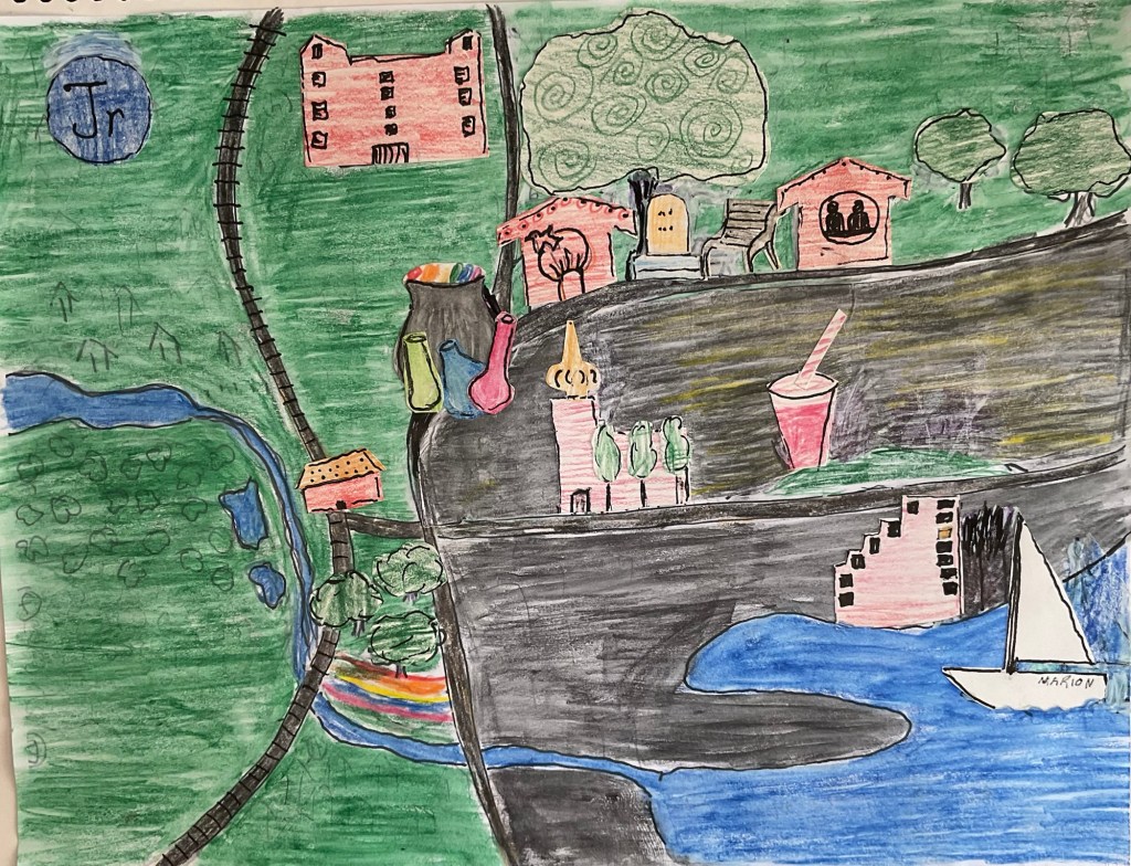
This is the almost-final layout, with everything in the right place, but some proportions a bit off. JR.’s icon should be smaller, the railroad station, a bit bigger. The colors are almost good, but the large grey swath is too dark.
Here are the icons on their own….
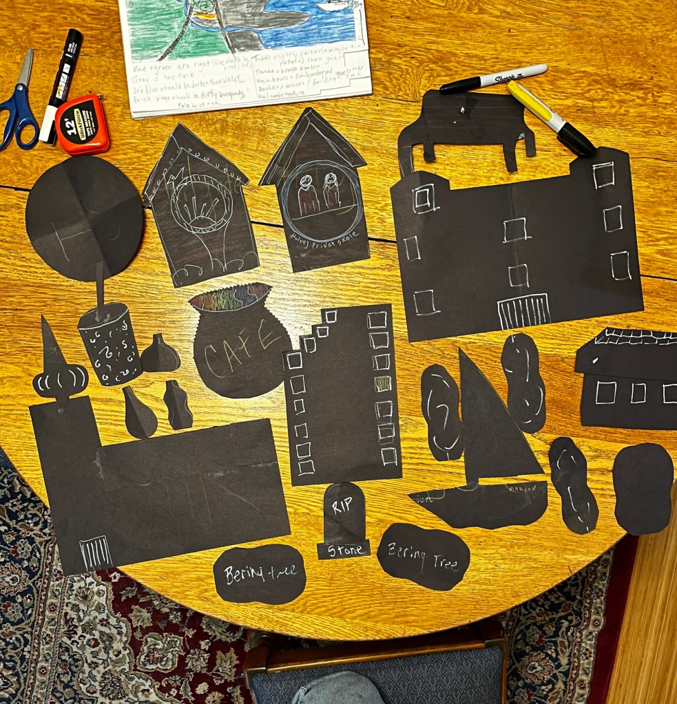
And of course, when transferring from the small paper drawing to an actual pattern, things can go wrong. Just taping all the newspapers together to make a 5.5 by 7.5 foot twin size was exhausting.
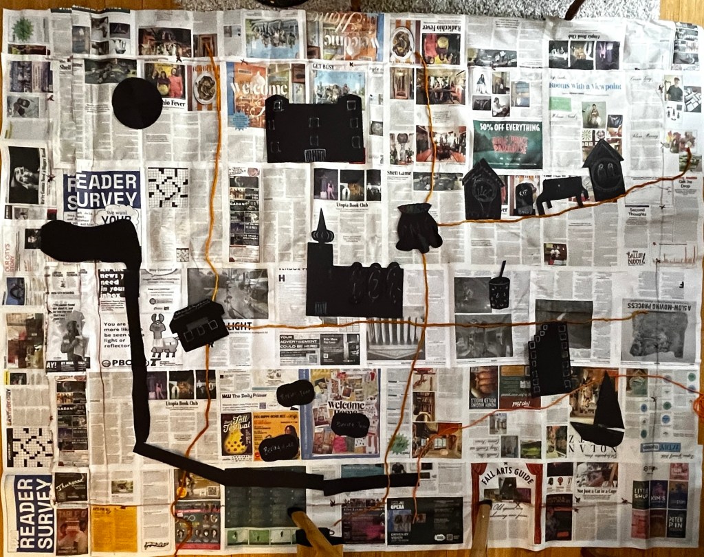
In this mock-up, I have corrected the sizes, so I can use these black shapes as patterns for the icons that will get ironed on.
But as you can see, the old church in the center has mysteriously shifted to the west of the Crooked Cauldron… sometimes my attention lapses. But actually, none of this is a problem until the time comes to iron fabric to fabric, so I’ll just be patient with myself and work slow.

Meanwhile, I’m getting a preview of what I need to buy and what it may add up to, using estimates from online shops. It will be interesting to see how accurate I am.
I’ll be going down to the Mill End Store next week to get the supplies, and I’ll let you know how that goes.
Love,
Grandma Judy

