Dear Liza,
A few weeks ago I painted a bunch of bright orange cards. I have never really cared for orange, but with the skies dark from forest fire smoke, I needed the brightness.

And I liked it! Orange is a bright, cheerful, aggressively happy color. How had I not seen this before?
I discovered my love of orange just in time. Ruth Inman’s friend Jody Tockes ran a class where we used torn paper to make a sunflower. And guess what? More orange!

And this week, Ruth is running an “Art Journal” class, and I got inspired. Of course, the class isn’t until tomorrow, but I felt the need to get an early start.

As usual in watercolor, I was disappointed by my first layer. It looked pale and boring. But Picasso said that unless you hate a piece somewhere in the middle, you will never make something you love. So I kept at it.
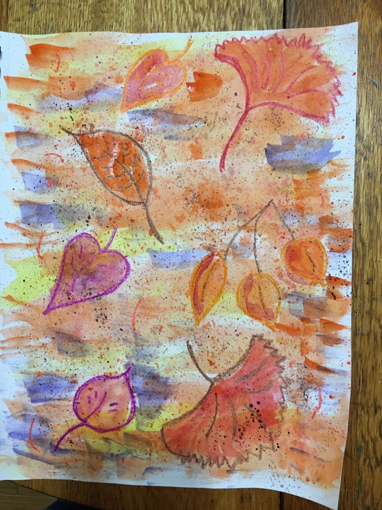
I got some purple in and laid in some more layers, and liked how it was looking. I decided it needed some words, so I browsed magazines for whatever seemed appropriate.

As always with art, I’d do a little, walk away, then come back and see what it needed next. I fiddled a little bit more and was done. But that’s okay! There are lots more pages in the book!
Love,
Grandma Judy

I.LOVE.IT! Water colors are like that, they dry lighter than you put them on.?. Unless you use liquid water colors! They are highly concentrated. It’s Beautiful!
LikeLike