December 28, 2025
Dear Liza,
This year, our Portland family got together for dinner, a movie, and collage. Yep, collage.
First, of course, was dinner. Slow cooker pork shoulder, lots of veggies, and Hawaiian rolls. Auntie Bridgett’s beautiful Christmas plates made everything sparkle!
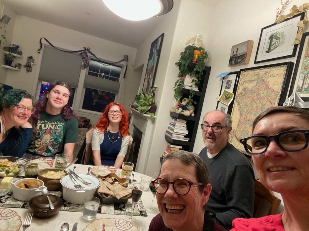
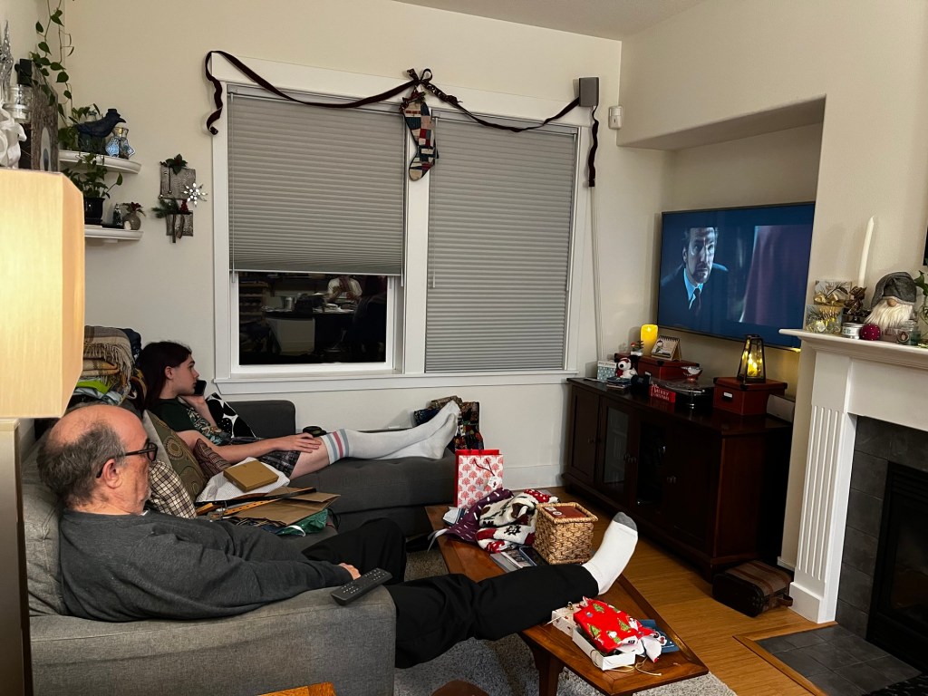
When we were all sufficiently stuffed, the party divided into two. The fellas watched Die Hard on the TV, because they wanted to, and it was Christmas. Not my favorite, but it’s not just my Christmas.
Meanwhile, we ladies went crafty. I finally passed my wedding dress (made by your great grandma Billie in 1974) off to Kestrel. Although it fit her, I don’t think she will wear it as it is, to get married or for any other reason. But it seems a perfect blank canvas for some textile crafting. We’ll see what comes of it.

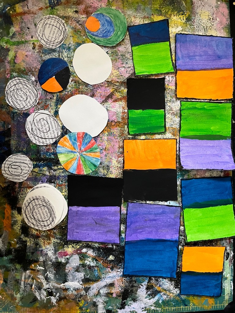
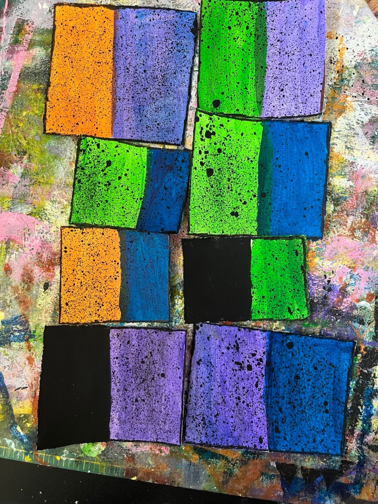
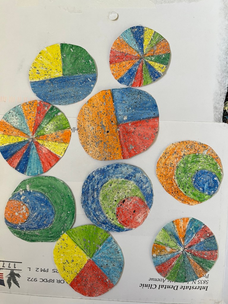
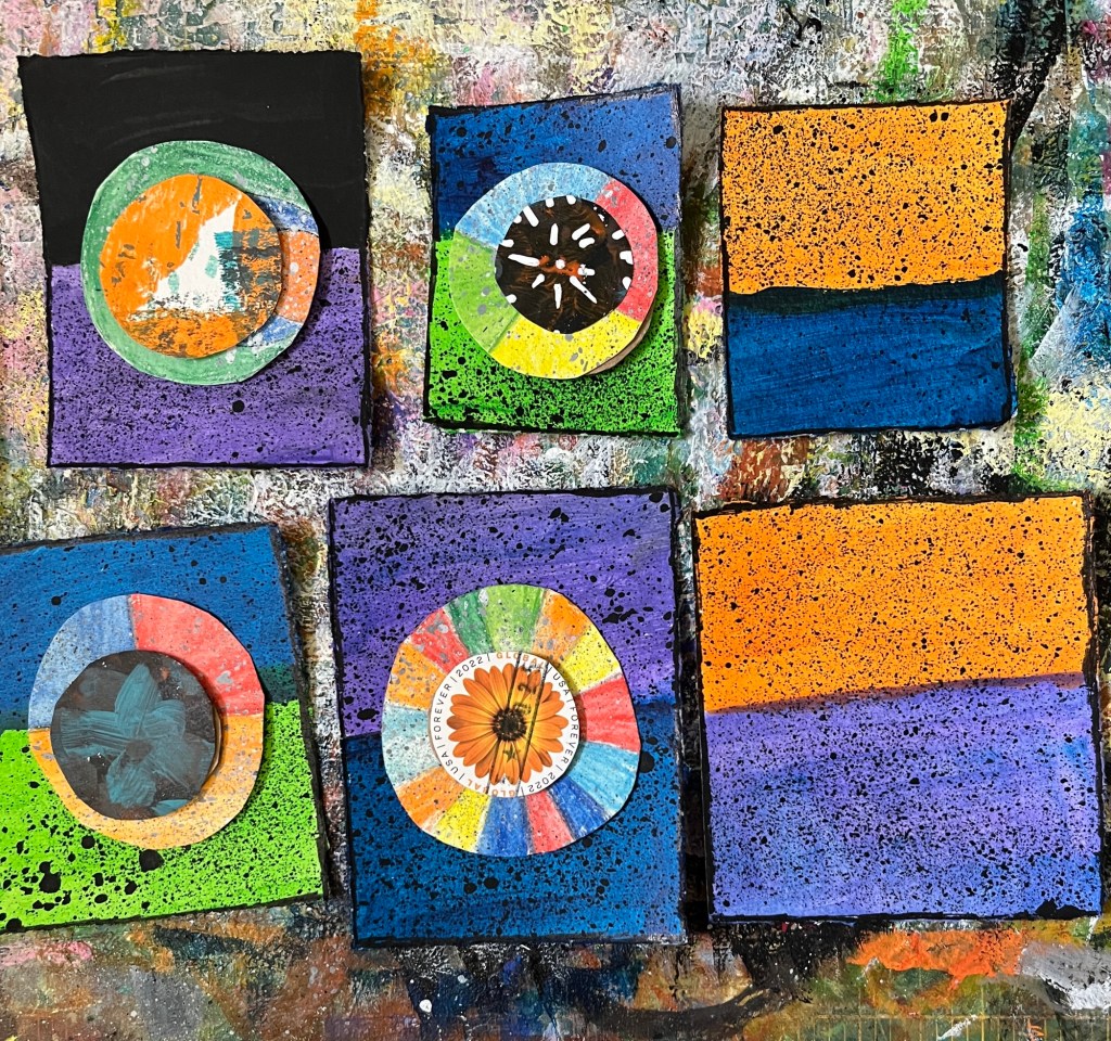
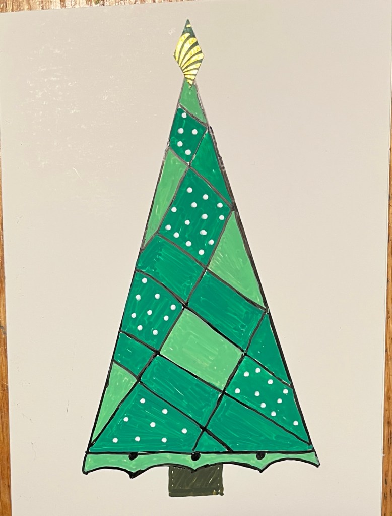
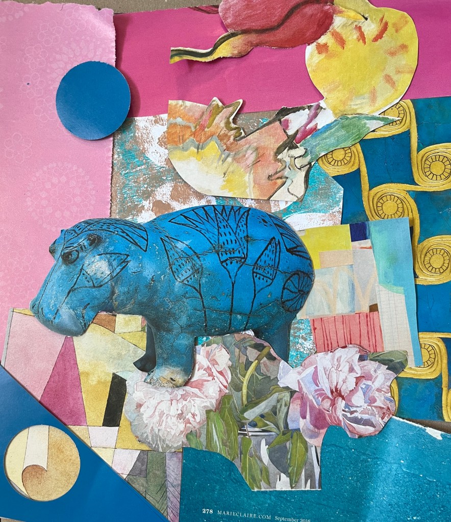
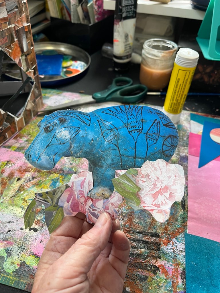
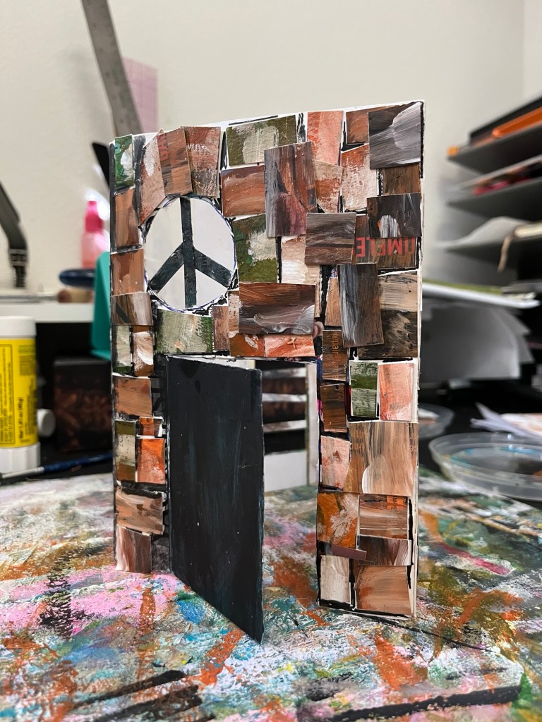
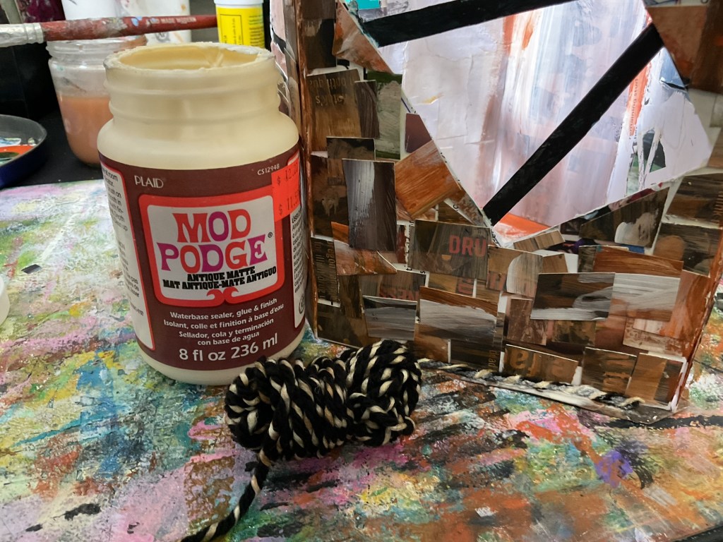
Then we settled down at the table for some collage. Kestrel helped me haul some boxes of collage papers and other supplies down from my art closet, and we went at it.
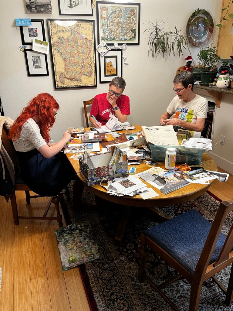
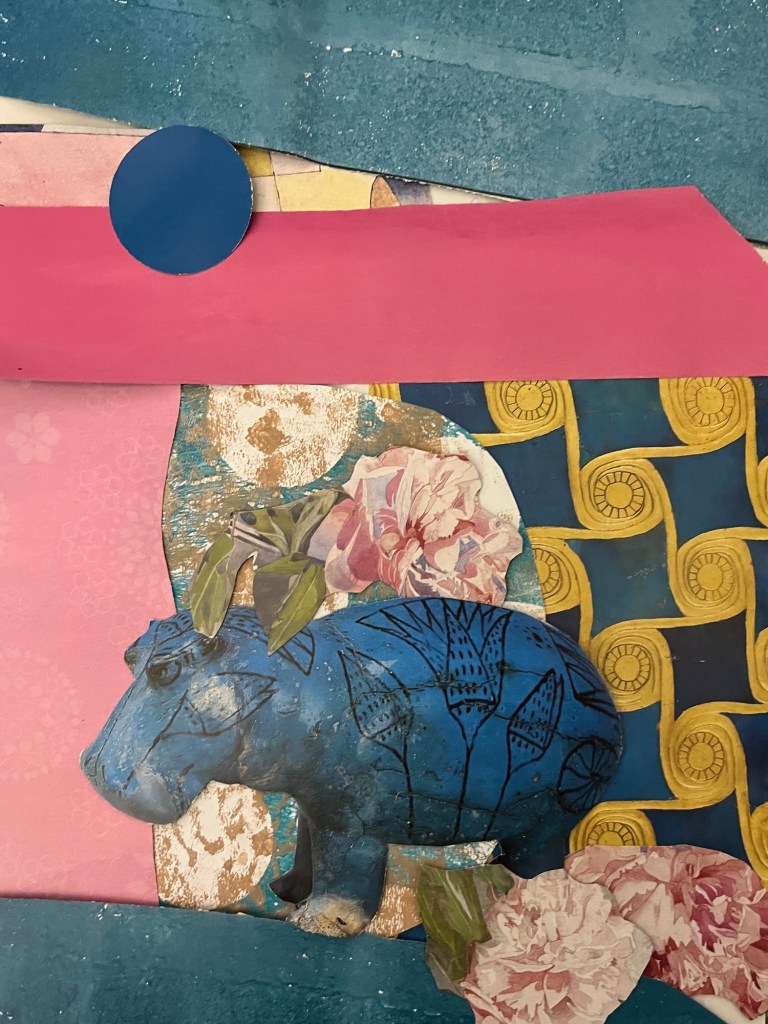
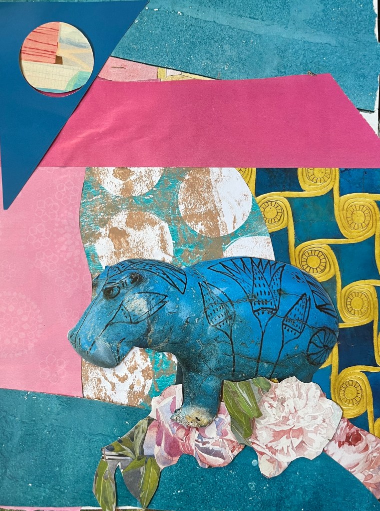
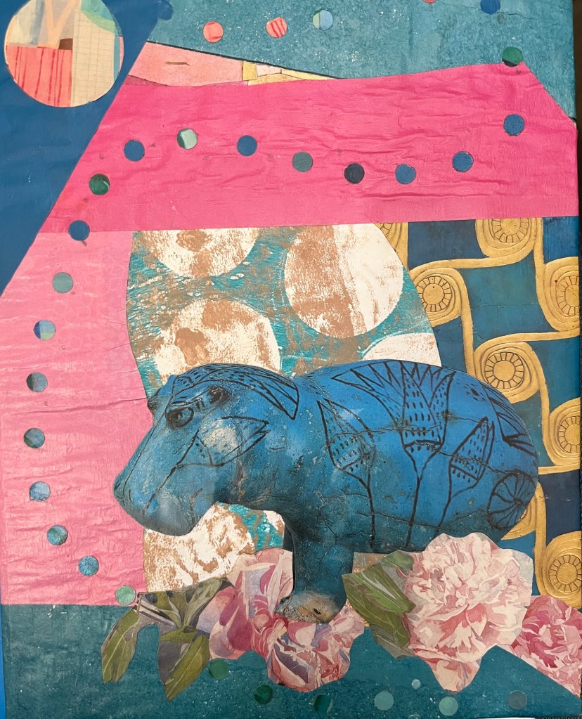
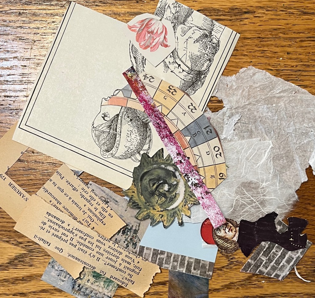
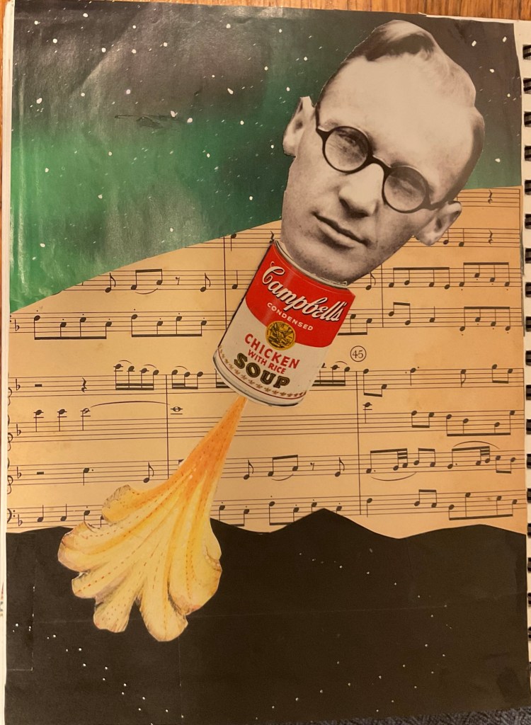
One of the boxes was a collection of vintage images from old Life magazines and publications from the Oregon Historical Society, and that determined a theme.
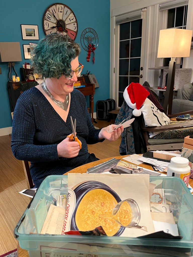
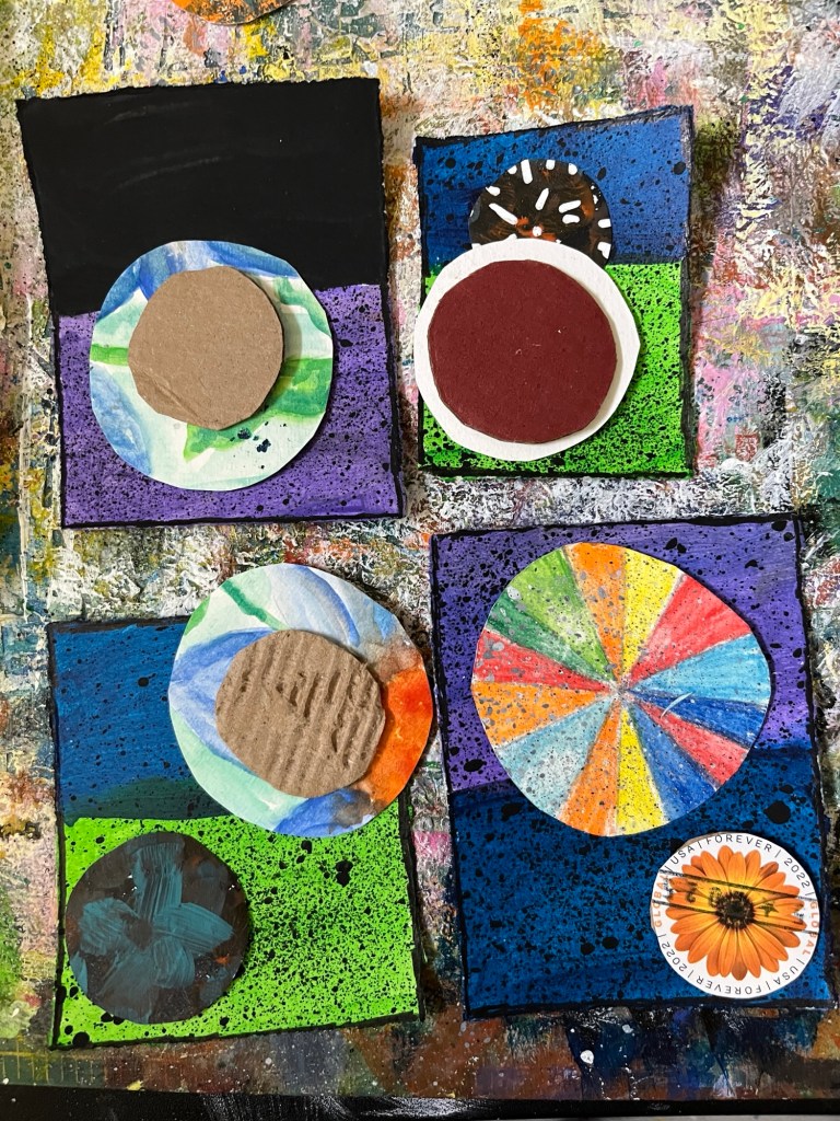
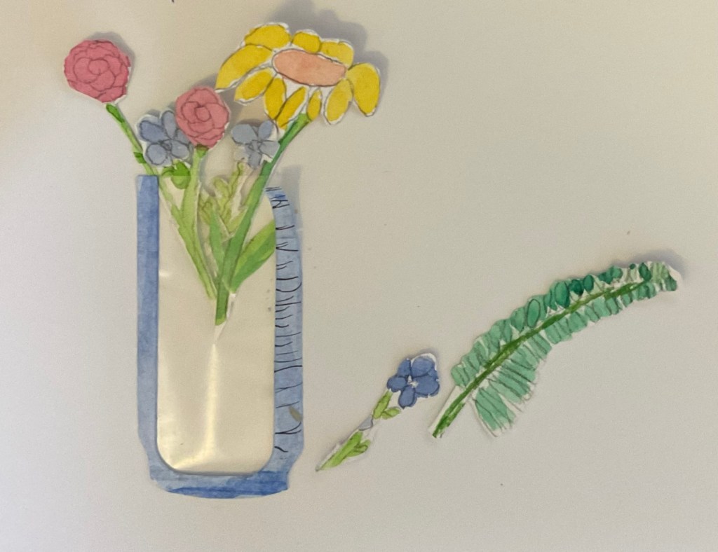
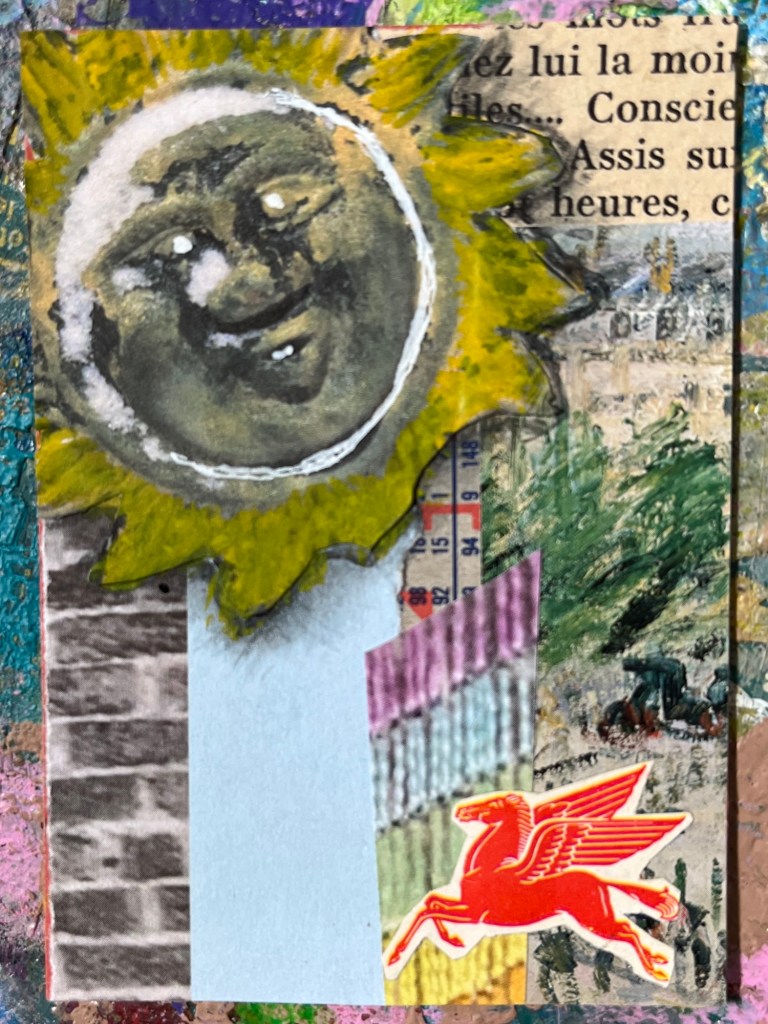
The other box was Jennifer Coile’s Art of the Met calendar pages, and they played together well. Here is Katie’s creation…
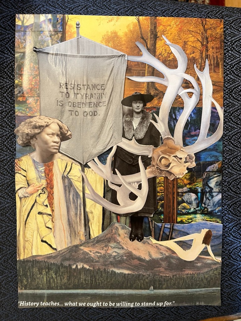
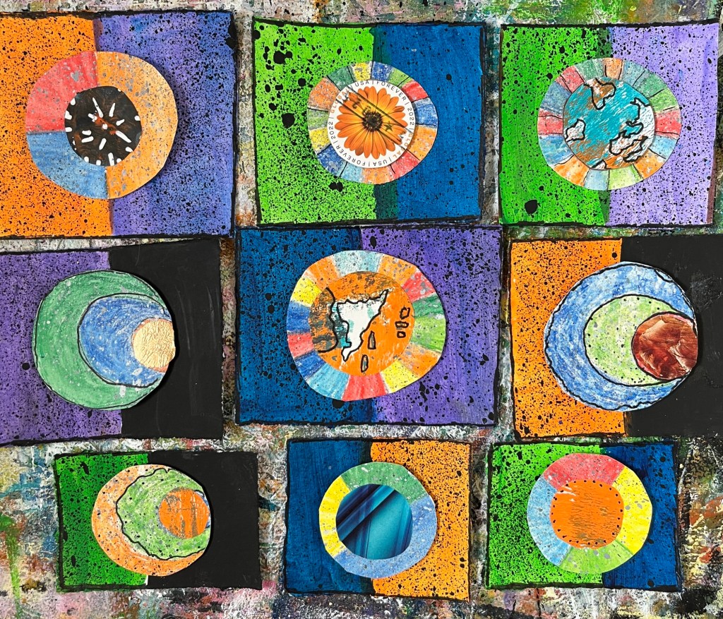
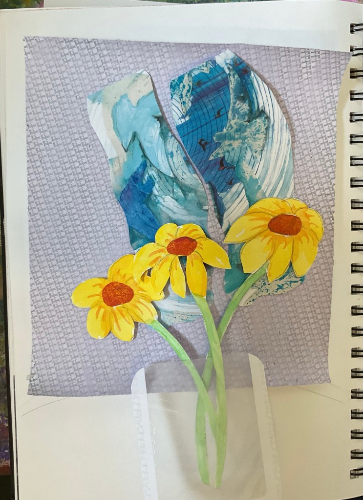
Here is Kestrel’s,
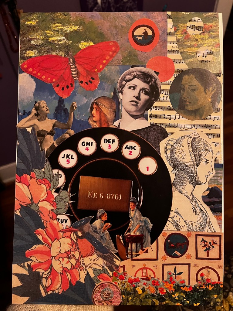
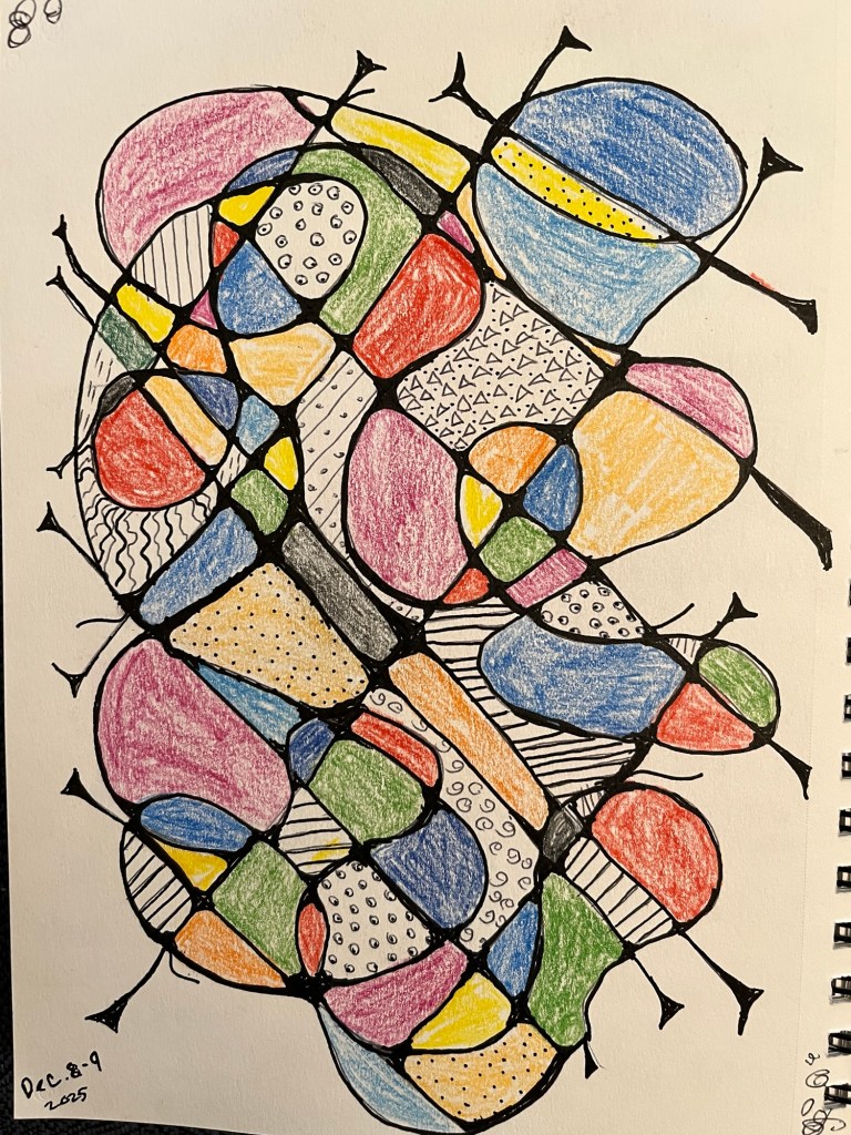
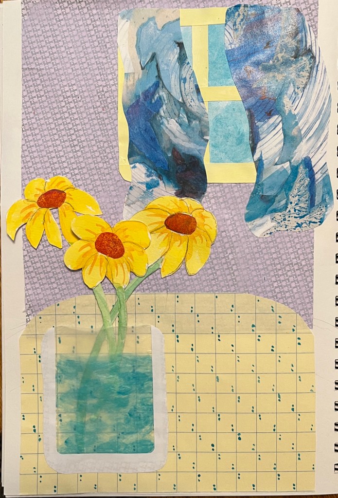
And here is mine. I love how creative we got with just old papers, lots of chatter, and some glue.
All in all, it felt like a very successful Christmas. Food, fun, and family, wrapped up in our weird personalities and seeing how everyone is growing into themselves.
The only thing that could have been better is if you had been here.
Love,
Grandma Judy