Dear Liza,
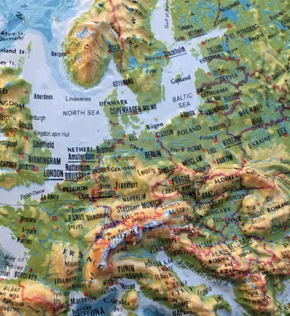
After the usual disorientation of an overseas flight and time adjustment, we are in Leiden, the Netherlands, and seeing all sorts of lovely things.
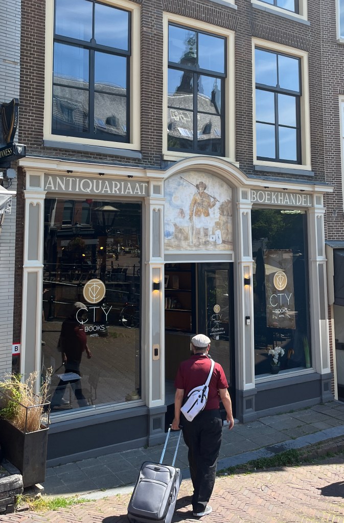
We are staying at a hotel called CTY Books, which is a modern place built inside a really old book sellers (from the 1700s). In a perfect blending of new and old, it has super nifty electronic locks but traditional Dutch stairs; AC for the hot days but is perched on a centuries-old canal.
The parts of Leiden we have seen are busy, modern city businesses that work in a very canal laced geography. This giant windmill sits beside a canal on the way from the train station.
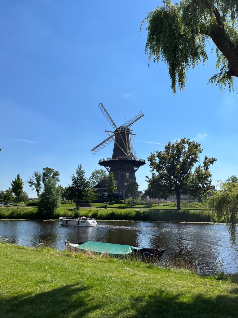
Canals are common in The Netherlands because the land is low and swampy, so for centuries the people have dug canals to drain the water away. The canals also make for nice transport, to and from the sea as well as around town.
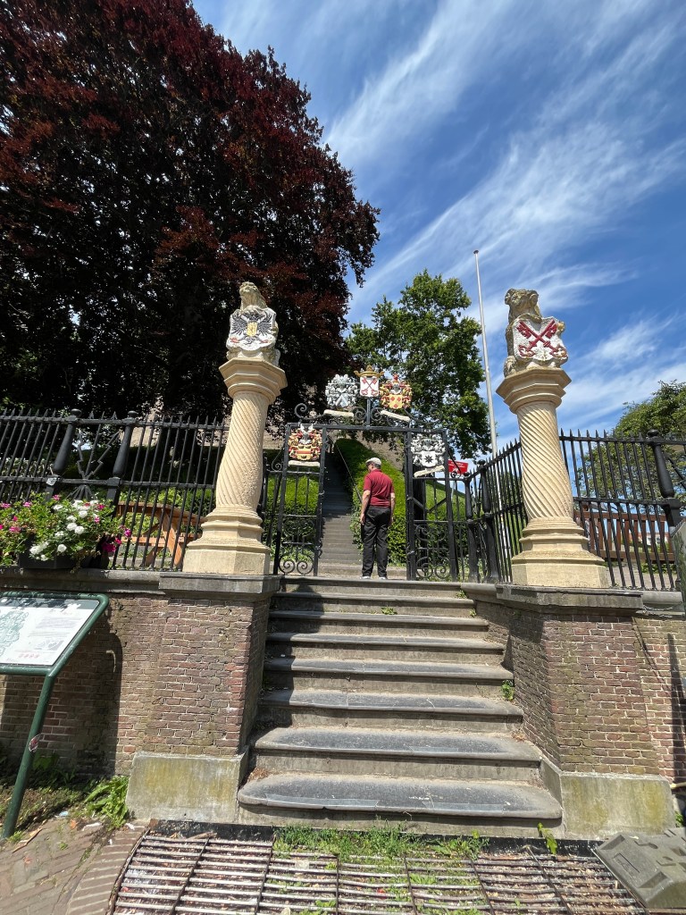
Our first day, we found De Brucht, which is the remains of an old castle.

It was originally built up as a high place to escape flooding, but when foreign armies threatened, they put a castle on top.
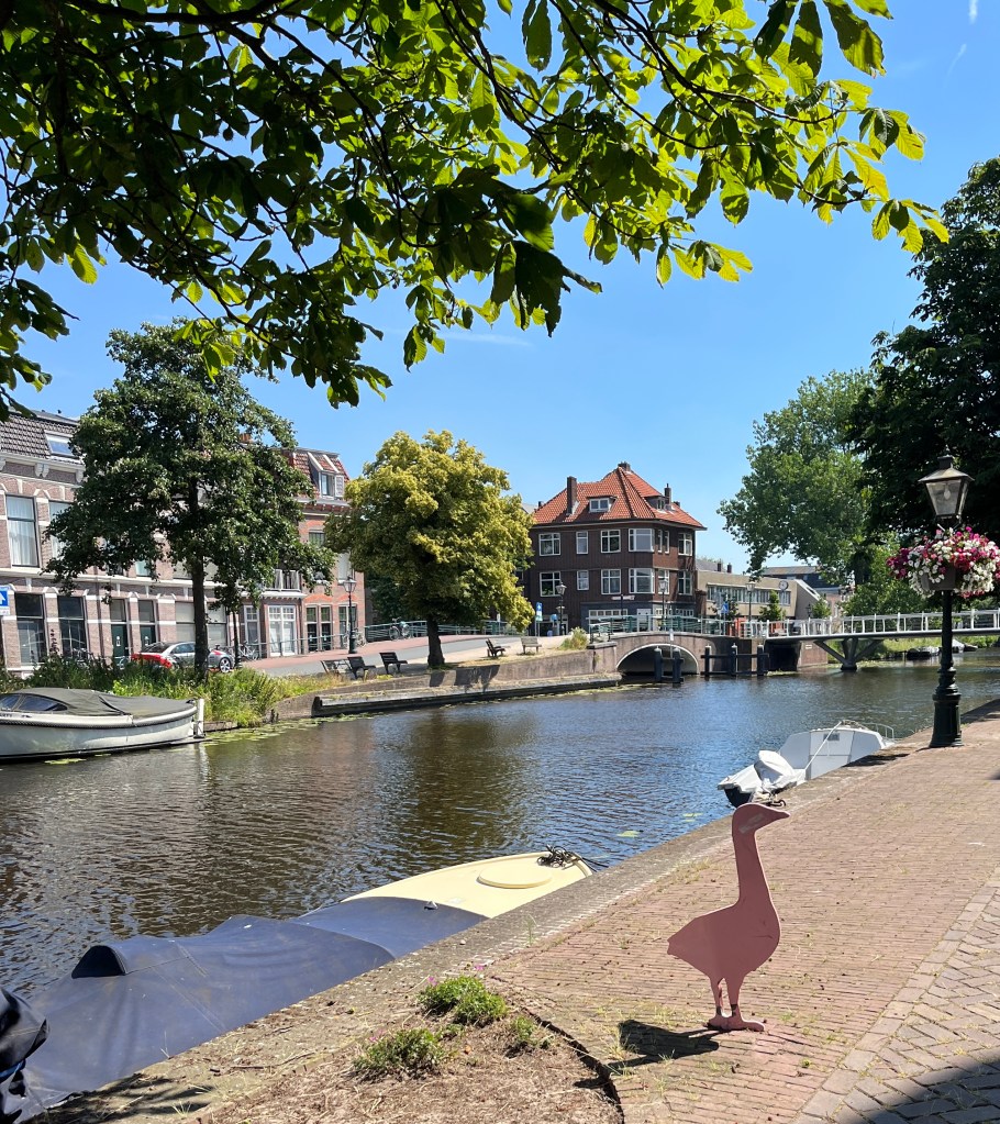
in in the midafternoon we started drooping from jet lag, and went up for a nap. Three hours later we were fit for more site-seeing, and wandered the neighborhood. The old, well maintained buildings and canals make everything look like a fairy tale.

De Landstrader, the restaurant just below our hotel, serves wonderful French fries, as well as salads and dinners. We stopped for some food and wine before heading back in for the night. We ate inside as the canal side tables were getting noisy and we like our conversation un-shouted.

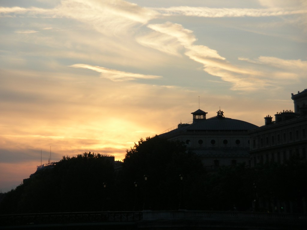
The sunset was stunning at almost 10 p.m. as we headed up to our cozy room.
Tomorrow will be another full day!
Love,
Grandma Judy